So, busy readers: breathe a sigh of relief. As well as the usual verbiage, this month's piece comes with pictures. The graph I used to illustrate last month's article on the meaning of scores, which depicted the frequency distribution of marks awarded by Jancis, seemed to pique some interest (see this thread in the Members' forum), so I've prepared some more in the same vein.
These, I hope, will serve to demonstrate further some of the points I argued in the previous piece. First, we will see that distributions are wholly personal, and can vary quite considerably between individuals who, on the face of it, use the same scoring system. There will be evidence of the 'arbitrary grouping' hypothesis – that the boundaries between scores, and in which of two neighbouring categories a wine is placed, are determined pretty much by whim. An extension of this is the idea of 'significant scores' – that some numbers have more salience attached to them, and harbour an unexpectedly large number of wines within their boundaries, at the expense of their immediate neighbours. Finally, we will see how someone's distribution can change over time, and therefore that the underlying meaning of the numbers is mutable even between different editions of the same publication.
Anyone who still wants to believe that wine scores are concrete, accurate and scientific should look away now.

Here are the distributions for the four most prolific tasters on the home team. Sample sizes are pretty good, ranging from Walter (4,382 scores counted) to Jancis (54,525). First of all, compare each taster's most oft-awarded score. Julia and Richard are most likely to give 16.5, while Jancis is a half-point tougher with a centre-point of 16. Walter is seemingly the hardest to impress, with 15 being his most common mark.
The different shapes of the distributions either side tell a story, too. Jancis may have a lowish central score, but is actually very generous when it comes to bumping wines up a notch or two from there: 16.5s and 17s are still plentiful. Julia is also fairly lavish half a point above her centre, at 17, but tails off much more steeply than Jancis after that. Richard is even more severe in his scaling above 16.5, with far more wines scored below his central mark than above it. [There is another complicating factor here: Jancis has opportunities to taste many more top-end wines, including verticals of wines likely to score highly – JH]
Nevertheless, all three more-or-less follow a typical bell-curve distribution, with these minor variations. Walter works differently. His pattern is much flatter, with little difference in the number of wines scoring 15.5, 16 and 16.5. Moreover, at 15.5, there is a dip, while the other three tasters' score frequencies only ever decrease either side of the central mark. This suggests that 15 and 16 are the scores with most salience, to which he would instinctively turn first, and that 15.5 only comes into play if necessary, to offer finer discrimination in a close-fought tasting. There is also by far the strictest limitation on high scores with Walter: out of 4,382 wines, only one has managed to scrape an 18.5. As a proportion of all wines tasted, Jancis has 100 times more with this score!
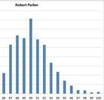
What about another popular website, using the 100-point scale this time? The following distributions are from the online edition of The Wine Advocate, spanning the last four years. Again, sample sizes are good, at 43,094 (Robert Parker), 7,025 (Neal Martin) and 7,436 (Lisa Perrotti-Brown).

Here is a pretty nice bell-type curve, centred on 90 points. However, there are a couple of salience effects in evidence. A significant spike appears at 90, and 89 is unusually low – contrary to expectation, lower than 88. Could it be that a certain proportion of wines are just tickled over the finish line into the most salient category of wine scores in the world: 90+ RP? There is certainly no law against this; it is up to the taster to choose where the quality boundary between 89 and 90 lies, and our responsibility as readers to know what it means.
The effect is repeated for that other super-salient category: 100 RP. In all the jancisrobinson.com graphs, there is a smooth decline in frequency as the scores increase from the centre, but here, we see a dip at 99, then a marked increase at 100. Should we conclude that there are more perfect than nearly perfect wines? No; just that the category of 100-pointers has been allowed to swell rather. (And this is not a recent phenomenon: the 99-100 point inversion is even more marked in Parker's Bordeaux (3rd edn) and Wines of the Rhône Valley, both published in the late 1990s.)

The Wine Advocate's UK-based correspondent Neal Martin shows a far more conservative plot. 90 is still the central score, and 89 looks low, but then so does 87. This saw-tooth pattern more likely suggests a preference for even scores, with the odds used only for finer discrimination if necessary (like Walter's 15.5). More striking here is the asymmetry between 85-90 and 90-plus scores, as well as the measured tailing off towards the highest points. Even 91 is almost twice as difficult to achieve as 90; Neal is clearly someone you have to work hard to impress, although it's far from impossible, and he does go all the way to 100 on occasion, although too rarely for it to be visible on the graph!

The new editor-in-chief follows the house style with a central score of 90, and from 93 upwards tracks very similarly to Neal. The hurdle to reach 91 and 92 seems rather lower, though, while 88 and 89 are awarded relatively infrequently, suggesting that 87 and 90 are the scores with broad-brush significance, and the marks in between are only brought into play when more resolution is required.
The same effect is even more marked on the following graph, from the 2003 edition of James Halliday's Australian Wine Companian (here's one I prepared earlier!).

The graph is very un-bell like: flattish between 84 and 88, then with a strong salience inversion at 89/90, and an unusual spike at 94. This is completely bizarre if you are looking for an elegant, bell-curve style plot, but actually makes sense if you remember that scores are only categories, and their boundaries are arbitrary. Halliday is simply operating a two-tier category system, where wines are divided into 87-89 (Recommended), 90-93 (Highly recommended) and 94-100 (Outstanding), for example. From the graph it seems that wines are first slotted in on this broader basis, at 87, 90 and 94, then subsequently awarded bonus marks for excellence within that category. It's a different approach, and one that is worth considering when using this guide to choose wines.
Now compare this with the plot of the just-published 2014 edition:

Isn't that scary?! The same salience effects apply: jumps at 87, 90 and 94. But rather than flat-bottomed valleys between the most significant scores, we see ramps, building up to those breakthrough numbers. And here the most common score has leapt from 85 to 94. The proportion of wines scoring 94 has more than doubled; the share of 95s has tripled; 96s and 97s have quadrupled. Has Australian wine got so much better, or is grade inflation hard at work here? Both hypotheses are difficult to deny.
However you want to interpret the manifest differences between the contours of all the graphs above, the comparison is strong evidence that scores cannot be understood in isolation. There can be no doubt that, to understand the score, you have to know the scorer.