My husband’s oldest friend is married to an artist – the sort of person who moves something you put down on her table because it doesn’t go with her colour scheme. She has recently discovered wine but, as you might imagine, what’s inside the bottle is much less important to her than what’s stuck on the outside of it.
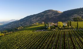
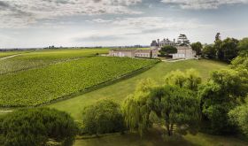
When her husband asked me the other day to look out for a suitable red and white for them at a tasting organised by his favourite wine retailer, it put an entirely new spin on my usual wine tasting routine. I have to say that usually I am guided about 95 per cent by the quality of the wine. If it comes in a particularly disgusting or ambitious package, then I also make a note of that, but I more or less accept that bordeaux comes in a high-shouldered bottle with a cod engraving of a château on the label, burgundy comes with sloping shoulders, complicated appellations and a lot of ye olde scripte, and most other wines come with bright colours, varietals and made-up brand names.
It was a fascinating and novel exercise for me to judge the wine bottles and labels on an aesthetic basis and, shamefully, the majority failed dismally. Most of the European labels were a mishmash of fonts and images – doubtless examples of organic growth from traditional origins. There was the odd southern French co-operative winery that had clearly put a lot of effort and money into making some of their inexpensive offerings look as though they cost twice as much – heavy, dark bottles and minimalist labelling – and some creatively retro labelling from Spain in particular, modern copies of typefaces that looked as though they might originally have been designed in the 1930s. And there is Italy – land of the designer – where some wine producers had clearly gone to the right address for some particularly snazzy labels.
But by and large the labels on wines from California and Australia tend to be much more aesthetically appealing, as well of course as being much easier to interpret with their clear statement of brand, varietal(s) and provenance (all too often an area as vague as ‘California’ or ‘Southeast Australia’, both of which mean next to nothing in practice – well, I suppose they mean ‘not Washington’ and ‘not Western Australia’ respectively).
It is hardly surprising therefore that even European wine producers are increasingly seeking inspiration for their labels from Americans and Australians. The first time I saw a blatant example of this phenomenon I have to admit I was shocked. It was seven years ago that I came across a red bordeaux that was being sold, with a jolly cartoon of a wine-laden schooner on the label, as Merchants Bay Merlot/Cabernet. The word Bordeaux was on the label somewhere because European law demands that all wines carry some geographical designation. But ‘Bordeaux’ was in very small print indeed compared to the clever name of the brand and those of the grape varieties. To a European like me, especially one who sees geography as the defining characteristic of wine, it seemed extraordinary to suppress a wine’s origins like this, but as Mark Jarman, the commercial manager of International Wine Services, the UK-based creator of this and other wines especially for British supermarkets put it to me recently, “the aim is to try to position Bordeaux in a more New World sense, to attract the sort of customer who wouldn’t normally think of buying French and to show that in fact the wine’s made from grape varieties they already know”.
Merchants Bay has been such a success that there is now a white version (Sauvignon/Semillon) and there are plans to extend the range and “give it an even more contemporary feel”. I do just wonder what the firm of Ginestet, Bordeaux wine merchants since 1899, thought when they unpacked their first-ever shipment of Merchants Bay labels to stick on their red bordeaux.
International Wine Services are now launching another branded bordeaux under the name Rivers Meet (as the rivers Dordogne and Garonne do near the city of Bordeaux). Ever resourceful, they have also come up with two ‘concept wines’. You don’t know what a concept wine is? Well the main thing is that it doesn’t matter a jot where it comes from, just what it’s for. In Britain we’ve had concept wines called things like Great with Chicken, Renaissance Red, Simply Sauvignon and Old Tart. IWS’s offerings are called Babe (in a shocking pink bottle) and Dude (in a Castrol can – no, I jest). I assume they are the logical extension of the phenomenon I am describing here whereby geographical authenticity becomes less and less important.
I was brought up short the other day when I came across a new pair of Portuguese wines. Over the last few years here in Britain we have become accustomed to the virtually complete Americanisation/Australianisation of Eastern European wine labels. You don’t buy wines from the ancient wine regions of Hungary, Romania and Bulgaria any more, you buy brands called things like Black River, Hilltop, River Route, Valley of the Roses, Craftsmen’s Creek and Idlerock and have to peer very closely at the small print to work out where in the world they were made.
And now it seems the Portuguese are having to resort to using a language other than their own to sell their wines. These Portuguese 2003s were very well made by João Ramos whose Marquês de Borba and Vila Santa have already established an international reputation. The red is a 50:50 blend of Trincadeira and Syrah, labelled Trincadeira/Shiraz of course to woo British wine drinkers already in love with Australian Shiraz, and the white a 50:50 blend of two Portuguese grape varieties Roupeiro and Rabo de Ovelha, bravely labelled as such. They’re made in Portugal’s warm south where Syrah flourishes, in the region of Alentejo. This means ‘beyond the river Tagus’, so what are the wines called? Tagus Creek of course – except that the vineyards are at least 100 miles from the Tagus itself which flows through a quite different Portuguese wine region, Ribatejo. But doubtless my even making this observation shows what a ridiculously literal reactionary I am.
Nick Oakley, João Ramos’s UK importer told me that the wine used to be called Loios but sales were shrinking so fast that he had to do something drastic to keep it on supermarket shelves. And sales have already doubled, from their admittedly modest base, since the Americanisation of the label. He knew it would work because his other Portuguese brand, Cork Grove, is already selling well in the US (even though the C-word is not exactly a positive for some more technically-minded modern wine drinkers). His point is that if a language is difficult, as Portuguese and most eastern European languages are, then it is only sensible to convert the labels to the language of the people who might buy it.
If this means that English is increasingly established as the language of wine, then I suppose that as someone who earns her living selling words in English about wine I ought to welcome the fact. I just wonder how long it will be before all those complicated Burgundian appellations are superseded by the Golden Slope brand? And Gironde Creek is surely just around the corner for Pauillac – so difficult to spell and say…
This article has been syndicated to more than a dozen publications around the world. See feedback in your turn.