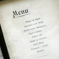
Menus are the financial and marketing lifeblood of any restaurant. Yet they often appear in a form even I find difficult to read – a consequence, I believe, of many restaurateurs fixating on their interior decoration rather than this vital medium.
To seek an expert’s opinion, I invited Mike Dempsey to lunch and went armed with about 20 different menus from around the world. I wanted his views firstly on the principles of what would make a menu easy and attractive to read and secondly whether any of those I had brought along met with his approval. I did not expect him, however, to be quite so critical.
Dempsey, 65, is a softly-spoken graphic designer who over a highly successful 40-year career has designed a whole range of visual material in the UK, from the layout for the original Independent newspaper to a succession of stamps for the Royal Mail (his next series on the 250th anniversary of Kew Gardens appears in early May).
Other than designing a wine label for a friend, Dempsey has had no professional connection with restaurants, although he did add, after agreeing to meet, that he has been a vegetarian since the age of seven. Once he had asked that we meet in Soho in central London, my choice of restaurant was easy and our rendezvous was fixed for Tierra Brindisa, a relaxed tapas bar that is also highly convenient for the theatres nearby.
Dempsey began by drawing parallels between the principles behind menu design and those behind the design of newspapers and buildings, which we also need to navigate daily.
'Both newspapers and magazines use headlines and then the body of the text, always structured in one of three definitive forms, to allow their readers to easily find what they are looking for. I think too many menus have drifted away from these principles and that as a result many appear visually confusing. Customers don’t have a great deal of time to make their choices, whether they are there for social or business reasons, and there is invariably a waiter keen to take their order. And, personally', he added somewhat exasperatedly, 'I don’t know why I have to read through all the meat dishes to find their one vegetarian offering.'
He then introduced me to the expression ‘leading’ (rhymes with ‘bedding’), the hot metal technique typesetters used to use in the pre-computer era, when a space would simply be inserted to break up the body of the copy. 'This is a very important tool', he explained, 'because it makes it easier for the eye to take in what’s on the page.'
Just as this technique can make navigation easier, the similarity between architects and restaurateurs became more obvious. Both work so long and so intensely on projects that are firmly locked within their heads that they fail to communicate what appears to be so obvious to them yet is completely unknown by the public. Dempsey had come across this phenomenon most specifically while working on creating the signage that has made the three theatres within London’s National Theatre easier to reach.
We then looked down at the place mat that doubles as a menu in Tierra Brindisa and ordered a cauliflower salad with oranges; a carpaccio of courgette with blue cheese and pine nuts; Catalan spinach with pine nuts and raisins; and piquillo peppers stuffed with aubergine purée. On the design itself Dempsey was equivocal. 'There is a clean logic to it and it’s easy to follow with all the dishes justified down one side and the prices down the other, but it’s not very elegant. It’s a bit harsh', he added.
As restaurants are about giving pleasure, menus should also convey the same emotions, and work to convey an overall personality, Dempsey added. He cited the menu at London’s Langan’s Brasserie, enhanced by a drawing of its late owner by David Hockney, as one of his favourites, even if one has to concentrate too hard to read all the dishes.
But he stressed that clarity was paramount and that if a menu were too cramped it was only easily decipherable to those who had already become regulars. The type should not be too small – he stipulated a minimum of 12 point to achieve this – and above all that that there should be as little copy as possible. 'I design by stripping everything back to utter simplicity, that’s how I believe you can make the strongest impact. Everything then becomes easier and more effective all round. Most restaurateurs, I think, should look at their menus and cut the words in half. I’m sure it would be a real struggle for some but I’m sure it would be worthwhile for their customers.'
Coffee ordered, we turned to the pile of menus I had brought. Dempsey thought the menu from The Walnut Tree in Abergavenny, Wales, was not that easy on the eye, and where the descriptions were too long, the letter spacing had invariably been squeezed too tight. 'And here is a good example of where headings would make it easier to navigate', he said.
Although he did not find the menu at Ramson’s in Lancashire ‘at all attractive’, he was struck by its direct approach, creating what he described as ‘an effective hierarchy’ by clearly spelling out the appetisers, first and main courses, and the price under the separate heading of how much? 'The typeface is horrid but the design communicates most effectively', he concluded.
These were kinder words than he had for the menu at The Seahorse, the elegant fish restaurant by the sea in Dartmouth, Devon. 'They’ve listed all their dishes down the centre of the menu but this means that the prices are all over the place. And the things that are in the biggest type, and therefore easiest to read, are the date and their policy on gratuities, which are really quite irrelevant when you sit down.'
Paris yielded one very clear example of a well-designed menu and one less so, both on the Left Bank. At Auguste, the vital menu headings are in red, the dishes in black and the dishes and prices strictly positioned left and right so that they can be easily read. Tan Dinh, the long-established Vietnamese restaurant with a great wine list, made it far more difficult for the customer by using only capital letters. A similar mistake was also made at Ballymaloe House in Ireland, where they use only italics.
If there had been a prize for the worst designed menu from my collection, Dempsey would certainly have given it to The Slanted Door, another Vietnamese restaurant, this time in the Ferry Building in San Francisco. Despite the excellent food, modern architecture and exciting views across the ocean, this extensive menu is written in only black and grey with indistinct signposting. 'I give up on this one', Dempsey cried, after looking at it for a few seconds, 'it’s like reading a list of stocks and shares'.
But just to prove how even the most experienced restaurateurs can improve their menu design, we ended with a menu from Boundary, recently opened by Sir Terence Conran in Shoreditch, east London. When I told him this, Dempsey replied, 'Well, I would have expected better. There’s no real logic to it and too many descriptions are simply too close together. I think it needs a complete redesign.'

